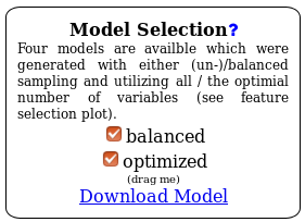
Summary: The oasis classification module distinguishes between 4 cases which are defined by two dimensions: Balanced versus unbalanced model and optimized versus non-optimized model. The classification generates four Random Forest models with regard to these 4 cases. In the HTML view you can choose any combination of configurations and the whole web page will update accordingly.
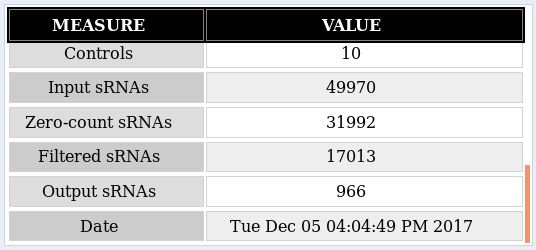
As a recap, the Classification module performs a binary classification on the count files input as control or treatment by applying a Random Forest classifier. The output includes different types of plots: data exploration, classifier performance and feature importance plots, along with an interactive web report of known and predicted micro RNAs (miRNAs) that allows you to subsequently perform functional analyses. The analysis example throughout this tutorial is the classification output of the Psoriasis demo dataset (Joyce et al., 2011). This tutorial aims at helping the user interpret the results of the Classification module. Further information on how to submit data to the Oasis Classification module can be found on the classification tutorial page.
The most important element of the results is the Model Selection displayed in figure . There you can decide which model configuration you want to investigate more closely. Furthermore, you can use the Download model link to get the underlying R model which you then can use in your own R programs.
In addition to the overview table the Classification module returns principle component analysis (PCA) plot (Fig. ) and Outlier plot (Fig. ) for the initial exploratory analysis of your data.
PCA plots are useful to understand whether control and treatment groups cluster separately, but are also good for understanding if other noticeable features in the data are present. The psoriasis data, for example, clusters into two biological conditions, where control samples appear in red and treatment samples appear in blue (Fig. ). The distinction between the samples based on their group is poor, which can have many reasons, most notably technical problems or problems with the biological specimen.

Technically, PCA plots show the two principal components of the samples used to train the classifier. The x- and y-axes indicate the level of variance "explained" by each principal component.
A complementary form of understanding how data is organized is given by the Outlier plot (Fig. ). While the PCA shows a multitude of misclassified samples, here samples 14 and 20 clearly show suspiciously high scores. Technically, the Outlier plot shows the modified Z-scores on the proximities reported by the random forest. In random forests, proximities are a measure of how similar samples are to each other (Breiman, 2001), so they can be used as input for methods designed to detect outliers. The modified Z-score has been proposed as a measure for outlier detection and is a function of the sample's median absolute deviation (Iglewicz & Hoaglin, 1993).

Please note that for ease of visualization, the outlier plot in Oasis shows your samples with colors associated to the class they belong to: red for controls and blue for treatments. However, do not confuse this plot with a depiction of how your samples separate.
Some notes about outlier detection:
While the PCA and Outlier plots should be used to assess if your samples cluster into their biological conditions, ROC (receiver operating characteristic) (Fig. ) and precision-recall plots (Fig. ) inform you about the actual classification performance.
A ROC curve shows the true-positive rate as a function of the false-positive rate. In a nutshell, the TPR (true-positive rate) is the rate of predicted true positive (treatment) samples over all positive (treatment) samples. The FPR (false-positive rate) is the rate of predicted false positives (control) samples over all negative (control) samples. An ideal classifier would have an ROC curve covering the whole "ROC space" and reach the upper-left corner of the space, corresponding to the point (0,1). A classifier that reaches such point would correctly predict all positive observations without incorrectly labeling any negative observation. In simple terms, the closer the red line to the upper left corner of the plot, the better is your classifier performance. The closer the red line to a diagonal line from the bottom left to the upper right corner of the plot, the worse is your classification performance (a diagonal line would signify random classification, i.e. the samples are randomly assigned as treatment or control, and not based on some sRNA measurements).

The ROC space is normalized and covers an area of 100%, so one very simplified way to represent classifier performance is to use the area under the ROC, or AUC, reported in the Overview section and on top of the ROC plot. As a rule of thumb, AUC values above 0.9 signify good classification performance.
Possibly a more intuitive way to graphically 5). assess your classification performance is the precision-recall plot (Fig. Recall is equivalent to the TPR (see above), indicating how many of all treatment samples classify correctly. The precision is the rate of true positive (treatment) samples over the sum of all classified samples (true-positive and false-positive). Given a good classification, a precision-recall plot will pair high precision with high recall.


The variable importance can be interpreted as follows:
A valuable plot for the identification of the ‘optimal’ biomarker set of sRNAs is the feature selection plot (Fig. ). It reports the cross-validated prediction error of random forest models trained by increasingly adding sRNAs, with the order of additions being determined by the sRNA gini indices. This feature selection strategy has been applied in previous studies (Ashlock & Datta, 2012; Erho et al., 2013).
Notes on feature selection:
The last plot that Oasis' Classification module provides is the error rate plot (Fig. ). It shows the Out-of-bag (OOB) error of the random forest model trained with the full set of features. This plot is useful to let you know whether the parameter NTREE of the forest has been correctly set. A sufficiently large NTREE will be reflected by OOB error rates for treatments, controls, and both classes that are parallel to the x-axis for higher NTREE values (green, black and red). Parallel error lines indicate constant classification performance for increasing number of trees.

The classification works with the expression level of sRNA molecules in your dataset. Those small RNAs that are the most different between healthy samples and disease samples will show up as the ones with the highest feature importance.

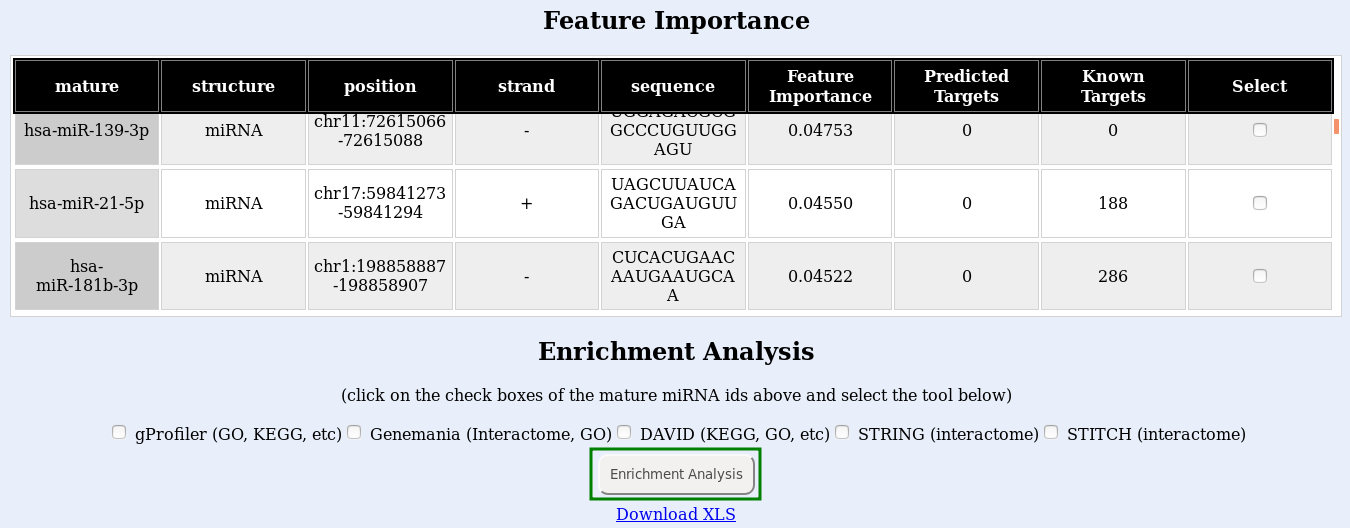
Finally, submit your enrichment analysis by clicking the Enrichment analysis button (Fig. , green box). You may submit jobs to multiple enrichment tools at once, but consider that a new browser window will open for each tool you use, and it will take longer to run. If the links do not open, try disabling your popup blocker.
Notes: